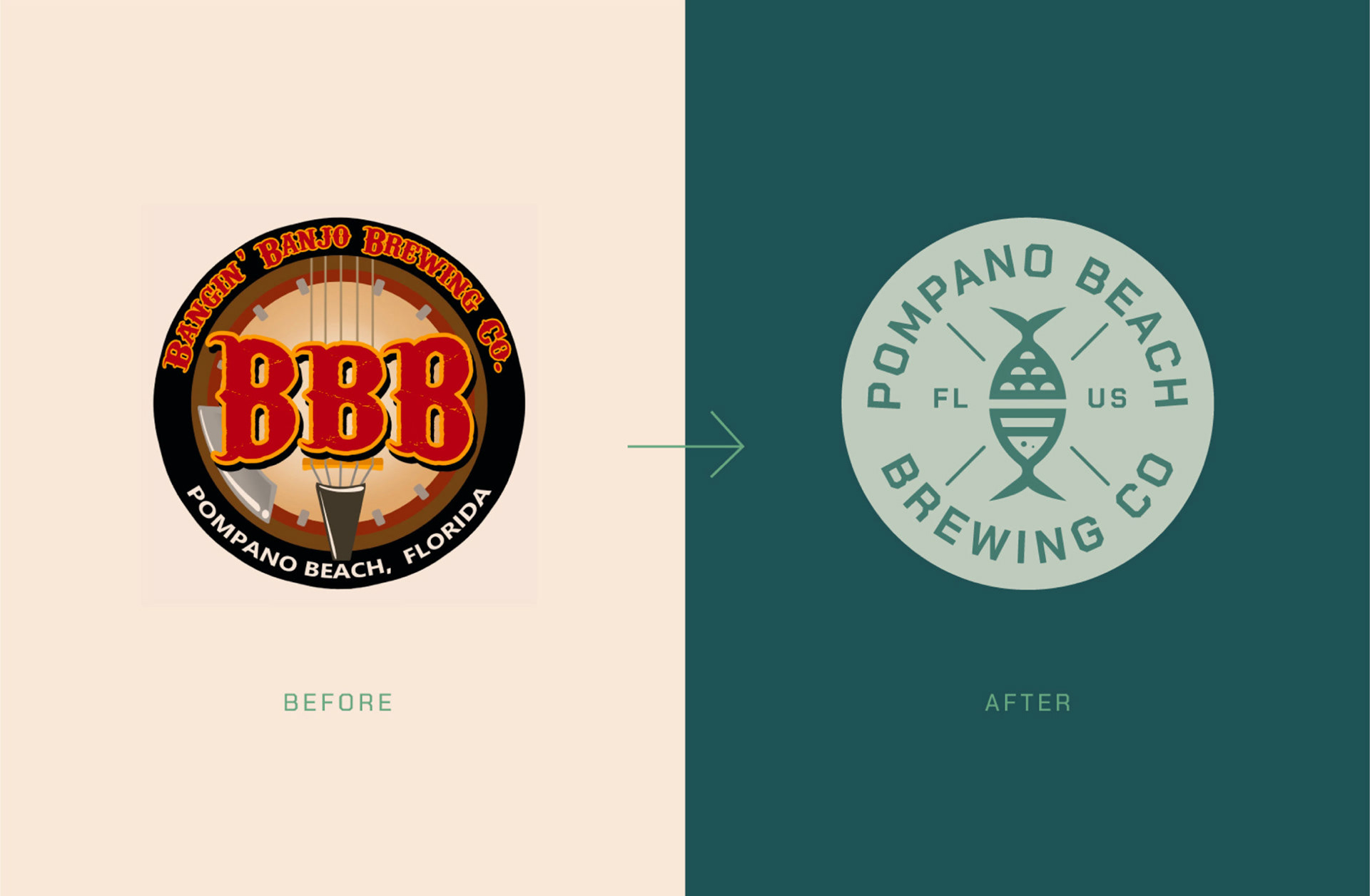
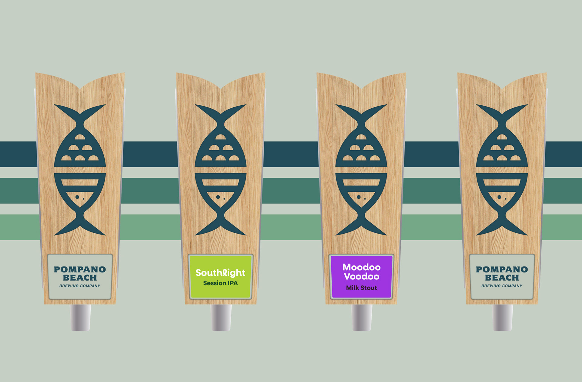
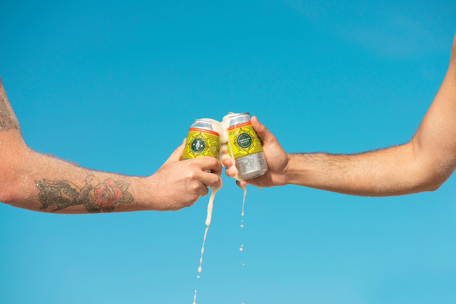
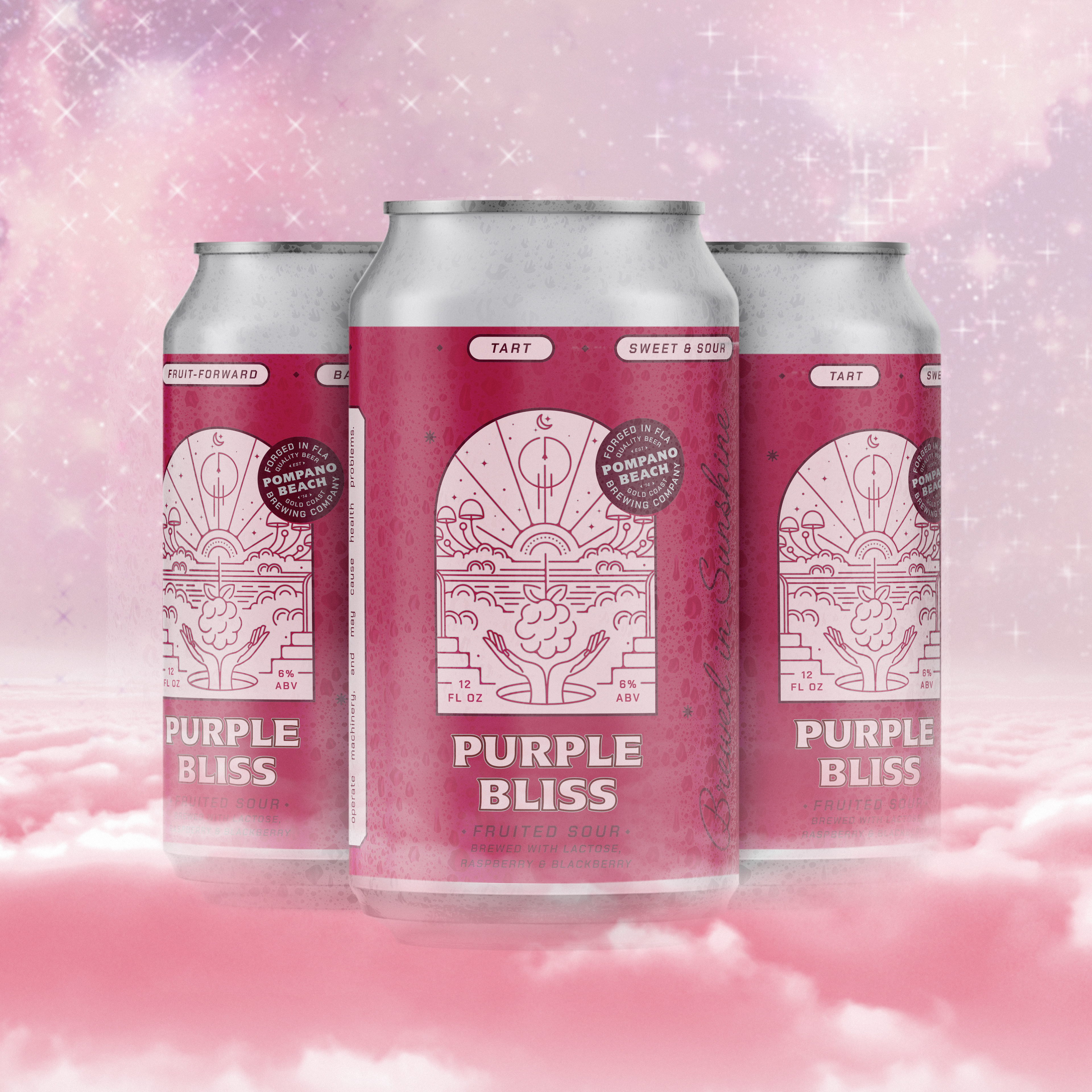
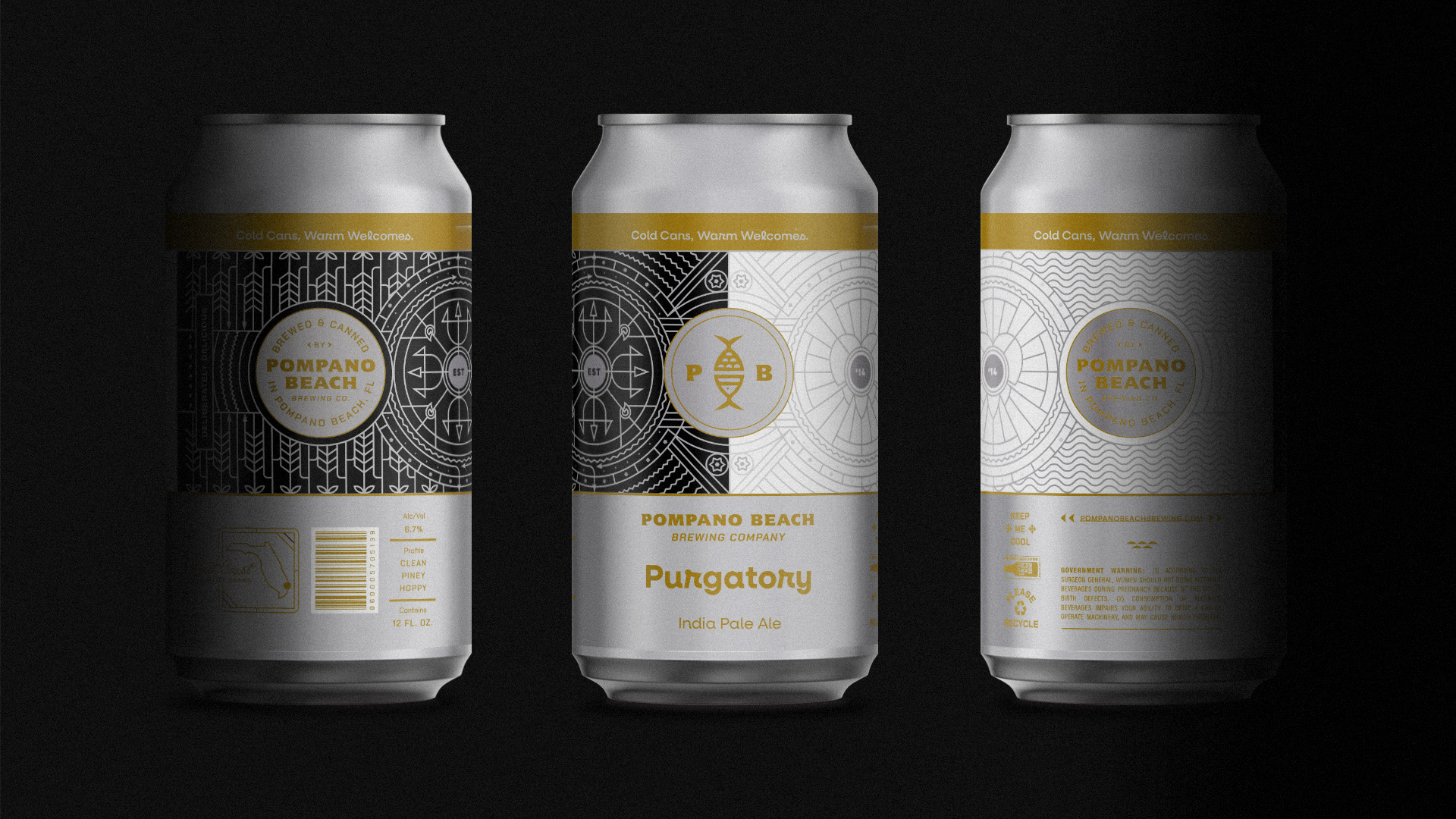
The new Pompano Beach Brewing Co. brand (formerly Bangin' Banjo Brewing) was designed to be a true representation of the brewery’s hometown on the east coast of Florida. We created a unique logo mark that reflected the brewery’s two primary focuses: the quality of their beer and Pompano Beach. To further represent their location, we overhauled their color palette to represent the greens and blues of the Atlantic ocean, along with a pop of Florida sunshine. This system was built out across print materials, tap handles, crowlers, cornhole boards, and more.
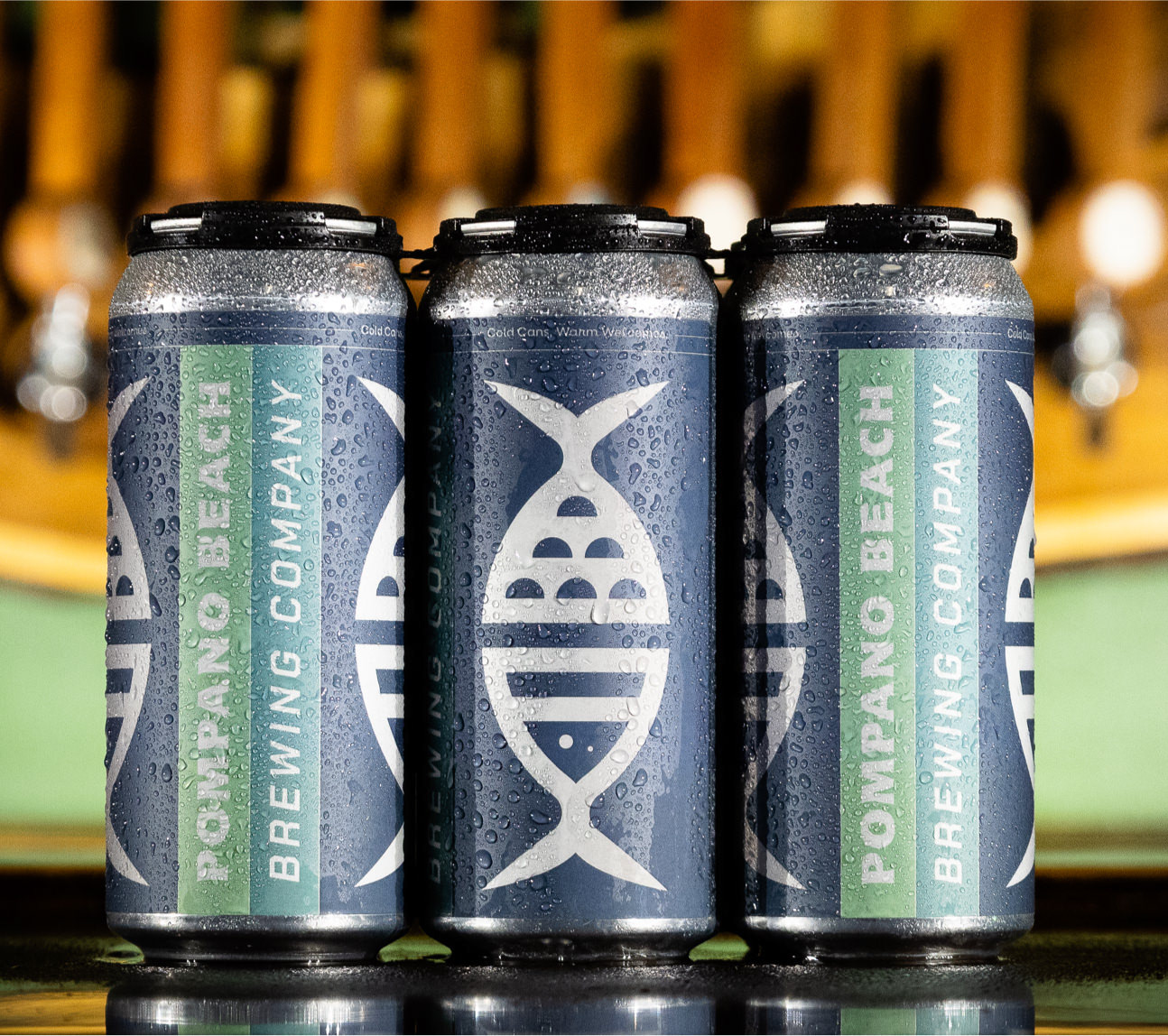
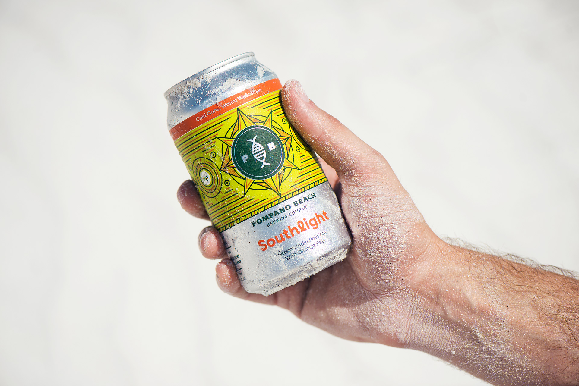
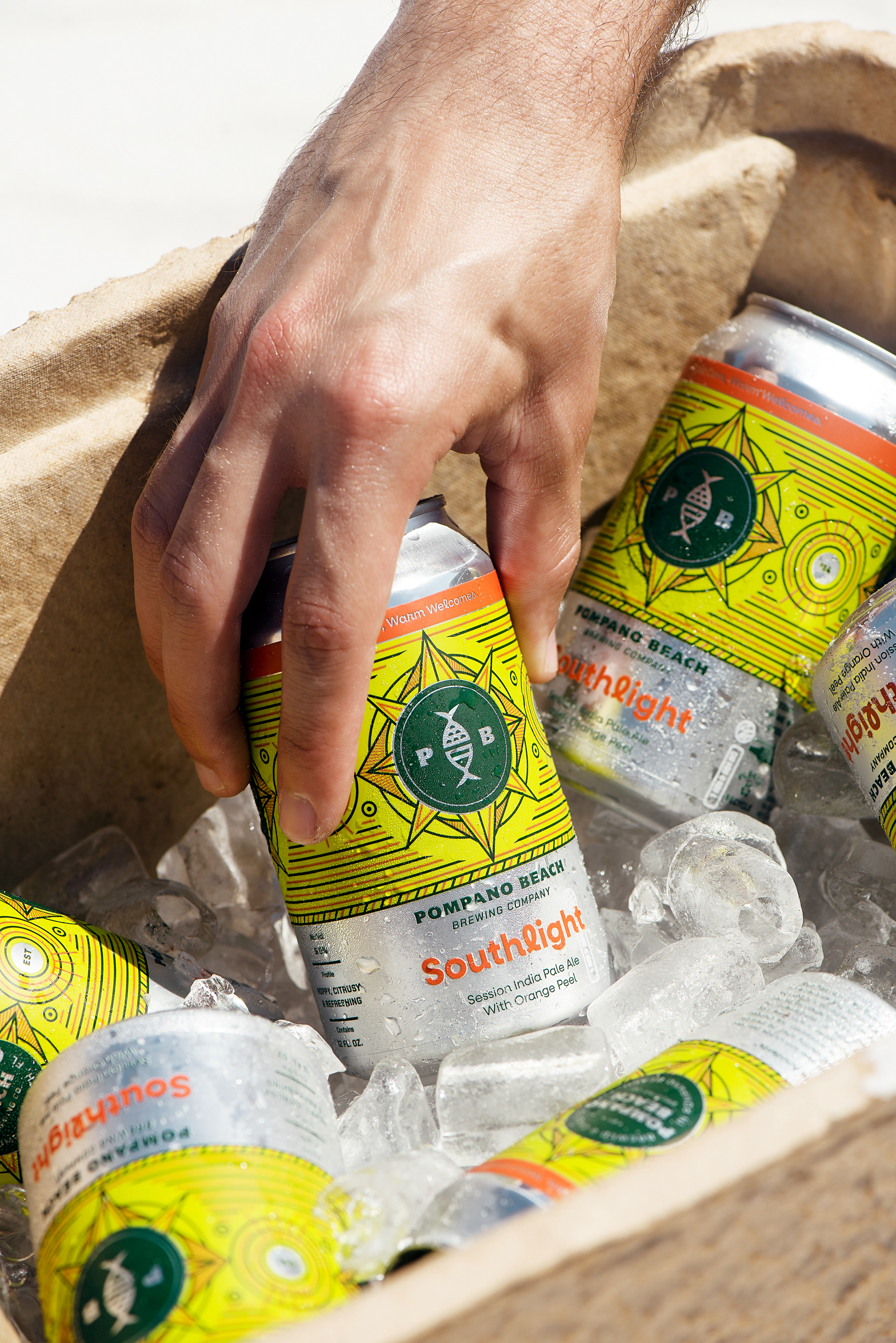
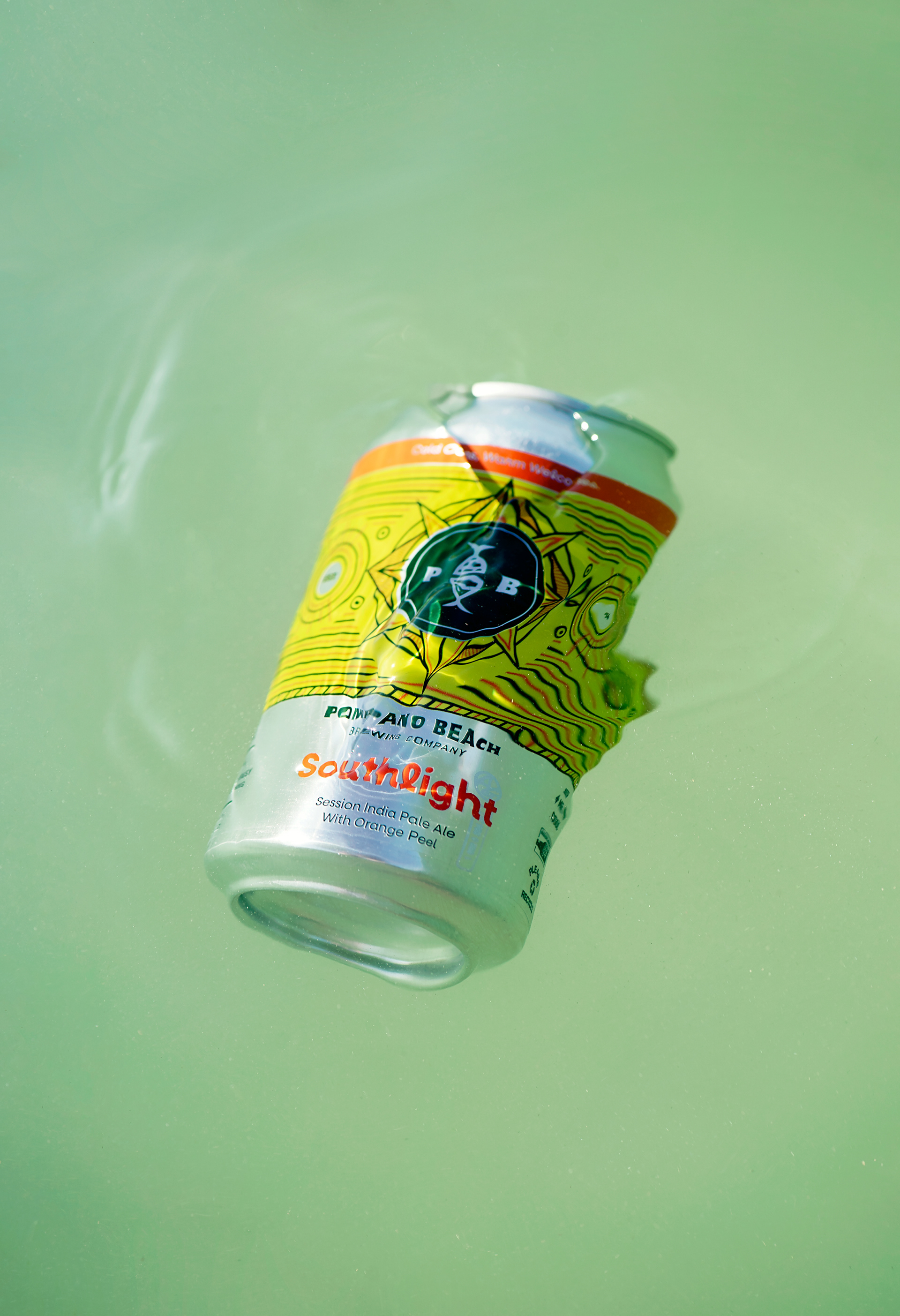
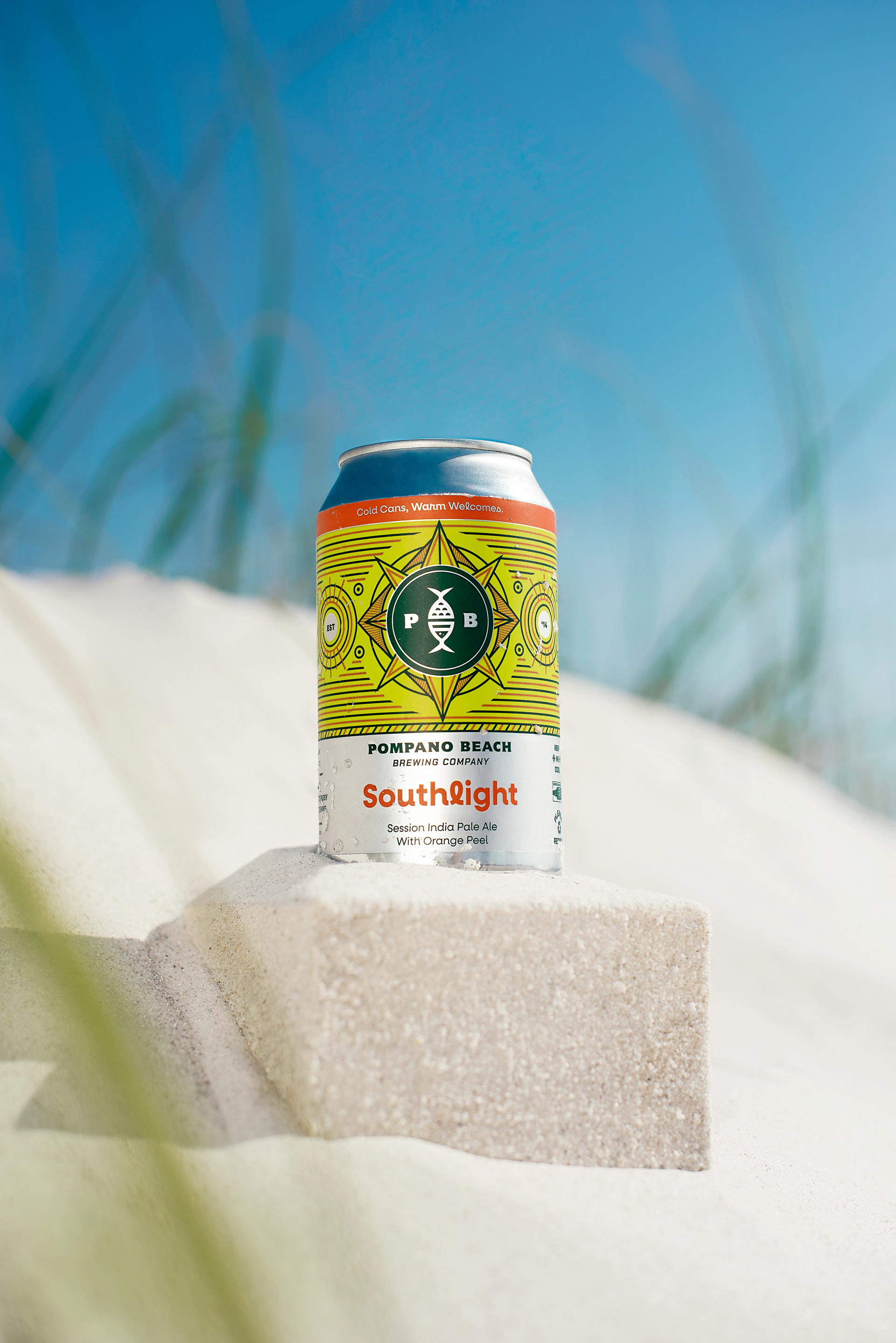
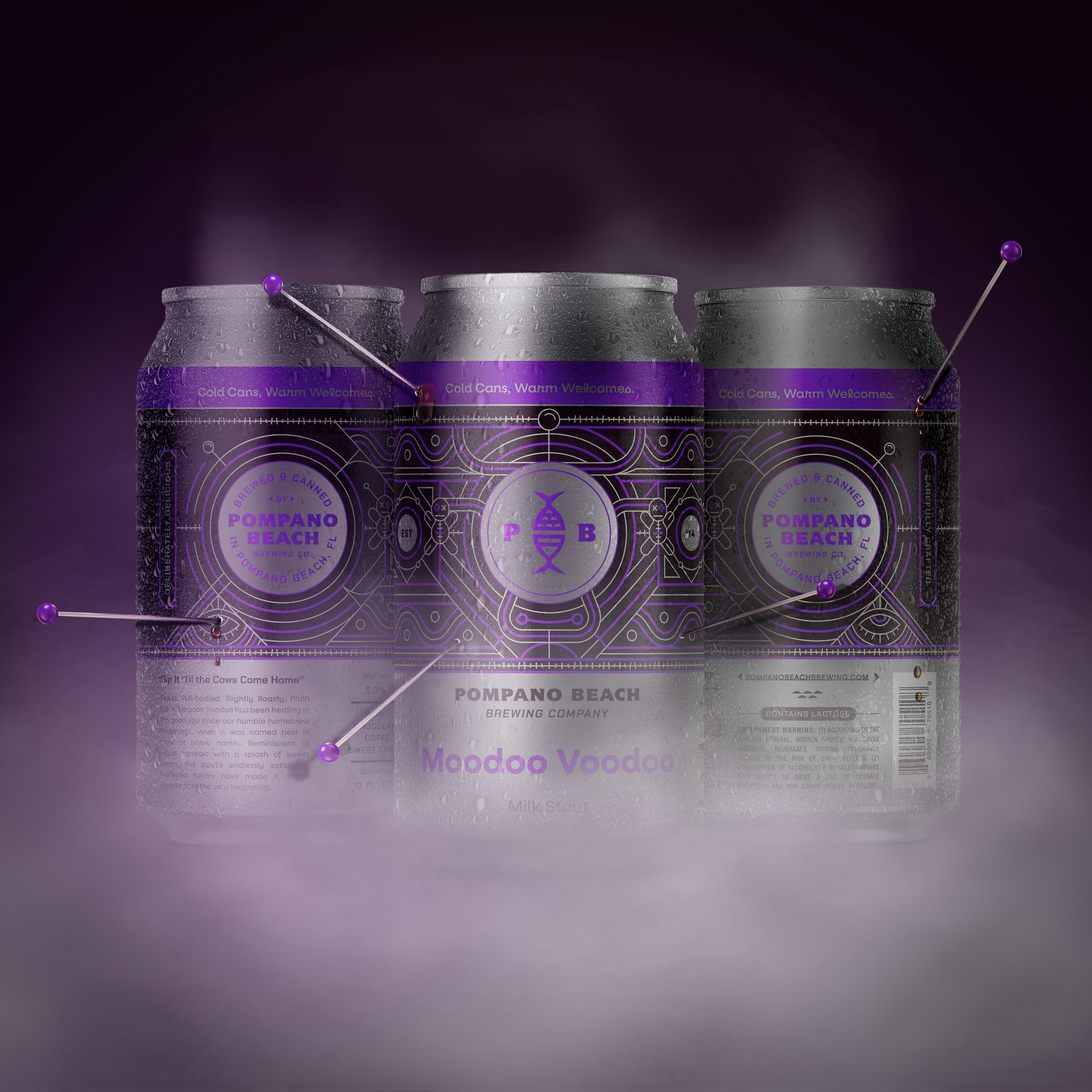
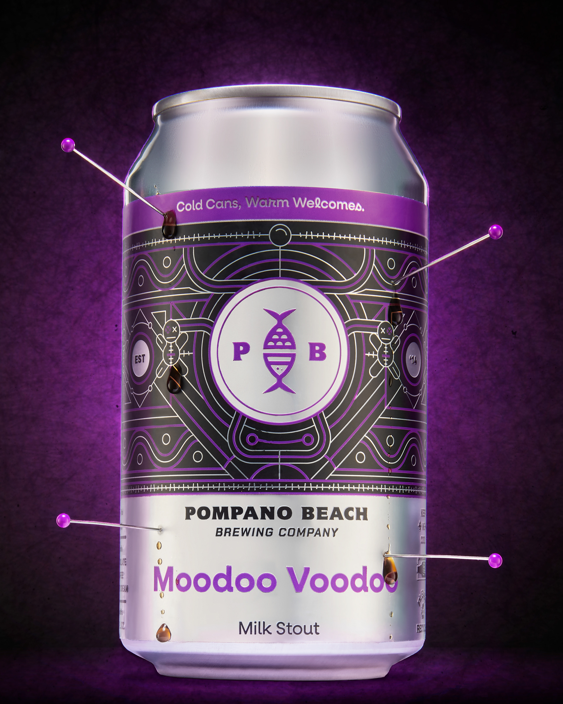
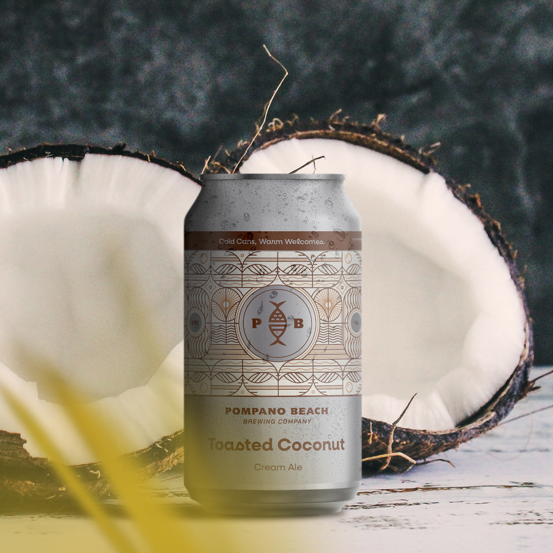
When approaching packaging, it was important to remember that this new brand was meant to be a destination — a true postcard of Pompano Beach. The core can designs needed a system that could tell the proper story of the beer inside. To achieve this, we developed a label structure that would house a custom pattern that would change with each core beer, all centered around the new Pompano Beach logo mark.


Project created at Top Hat
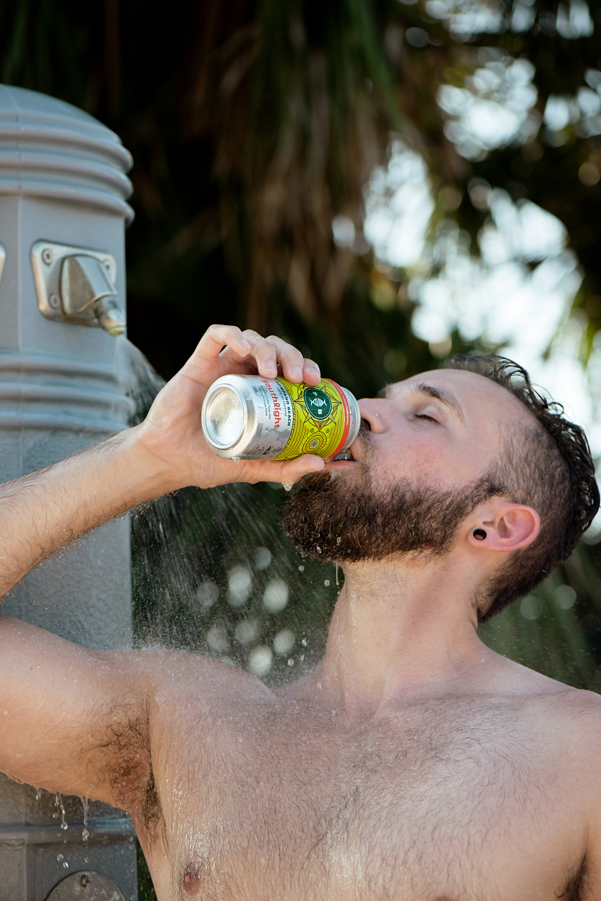
Southlight Photoshoot: Amie Santavicca | Moodoo Voodoo Photoshoot: Brian Kaldorf